To illustrate what I mean by all of this I researched into a few books that would help me refine what I like about fashion, and how it interests me graphically.
And so I began with...
Graphic Design for Fashion,
Jay Hess and Simone Pasztorek
(graphic design for fashion is literally what I like/ and mean I like about the fashion industry)
Almost instantly there was a paragraph that I felt helped me to understand where graphics and fashion met and why it did so. I think that this makes the relationship between the two definable and understandable.
... His collaboration with art director Marc Ascoli and photographer Nick Knight became the defining moment of modern fashion communication. Almost immediately 'Graphics" became as vital for fashion as it had for the music industry.
And then the next part explains why I like graphic design for fashion, and helps me to explain what it is I exactly like about working with fashion...
And I also believe I am driven commercially and so the fashion industry is a optimal outlet for this interest. As I said before I like the press, promotion and advertisement of fashion.
But it doesn't end there I would say I am also driven by the branding and identity side of fashion and I find it really interesting.
Branding (in Fashion)
Is the conscious management of the public perception of, and personal identification with, a fashion label. (pg13)
 |
| Acne art department for Acne Studios |


 |
| Buero New York for Kai Kuhne |
 |
| Deeva-Ha for GAR-DE |

 |
| Mevis and Van Deursen for Viktor & Rolf |
Viktor & Rolf have a very strong logo, it is the black stamp. And the type features the ampersand in a circle.

 |
| Stiletto NYC for threeASFOUR |
An experimental piece of design. Clean and simple.
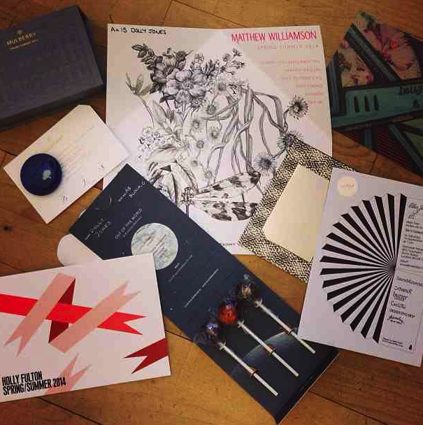
Invitations
Announce, build anticipation and grant admission (to seasonal fashion presentations. (pg61)
'Usually very few invitations are produced, providing the graphic designer withe the chance to explore specialist production techniques' - (pg63)
This is something that really interests me as a designer, the use of stocks and printing techniques such as; embossing, dembossing, foiling e.c.t and this is an outlet to do this. But I feel that you can do this with other content too.
 |
| http://mialinnman.blogspot.ie/2012/08/graphic-design-perfection.html |
 |
| http://www.behance.net/gallery/Louis-Vuitton-Invitation-Origami/3735839 |
All sourced from my own Instagram account...
 |
| (id_magazine) |
 |
| (brittish_vogue) |
 |
| (badgalriri) |
 |
| Base for Loewe |
The studio's early relationship in the fashion industry developed through friends. For success Brunfaut emphasizes the importance of creative curiosity ....
... "It is a world that we understand and that affords us freedom and creativity".
 |
| Roanne Adams for Bodkin, 2009 |
"The fashion Industry is completely image-based, so it give graphic designers the opportunity to show off, create things that people don't necessarily have to understand on a literal level"
 |
| Studio Small for Margaret Howell, 2008 |
 |
| Paolo Bazzani for Kenzo, 2009 |
This invitation came in the form of a pop up book, as you can see it is very intricate, delicate and detailed, which is perhaps representative of the collection and nature/ the butterfly itself. A huge amount of time has gone into this and so you can say it is not as rigid as other invitations, due to its 3D aspect it is more interactive, eye-catching and innovative.

 |
| Studio Thomson for Preen |
Lookbooks
Are a visual documentation of a single season. Exclusively distributed to members of the fashion industry, cookbooks become a physical archive of the fashion label.
This type of content is similar to magazine/ editorial work and so this interests me as well. I think that a lookbook is more specific and has a smaller target audience. But you can draw inspiration from them and you get a feel for the brand/ collection, which could help with research. However I do prefer work for magazines over lookbooks.
 |
| William Hall for Mother of Pearl, 2010 |
I really like the layers, the different textured stock, the vague image of the girl, the black vs white and the gold foiling of the type, and the very simple sans-serif type as the title. Also the sizes of the paper go up in a correct scale and so they work well together.

Simple, playing with the use of grids, and the use of negative space, doesn't need words. Striking and modern, fulfils its function. Again focus on the textured stock, meaning it is a higher-end, luxury product.
 |
| Plug-In for Journal Standard, 2006 |
Working/ Experimenting with the use of grids, like above. Very minimal. Grungey effect of the photographs contrasts with the straight white borders and space, which is clean and clinical, the balance works very well.
 |
| Plug-In Graphic for ARTS&SCIENCE |


In these two images I like the branding, the mint and mutual colour scheme, the use of photography, the use of a grid. The use of screen print (gold type). And the front cover. It is elegant and stylish, yet traditional and modern at the same time.
 |
| Manuel Raeder for Bless, 2006 |
Again this lookbook, experiments with the use of a grid, it also plays with orientation i.e. the type on some of the page goes from bottom to top, horizontal, where as the images remain portrait. Also there is a use of layering of the type and the images, which is interesting. However it is mainly imagery, but they are laid out differently on each page, and so this adds variety.
 |
| Johan Hjerpe for Diana Orving |
 |
| Julia Born for Joff |
I like the type, layout and pattern on this front cover, however I do not like the yellow colour, but further in the book the pages are yellow and grey which work well together in this.
 |
| Manuel Raeder for Bless |
In this lookbook, I really like everything about the type, I like the fonts, the colours, the range of weights. The way the word has been broken up like language.
Packaging
Is primarily ised to hold and protect products when on display or after purchase. It provides an additional creative outlet to extend the brand experience.
 |
| Homework for Fleur Tang 2002 |

Takes the idea of the box package further, the black contrasts well with the light brown. Yet it is still stylish and modern. This is also more interactive and 3 dimensional. It is also a clever way to host the boxes within.
 |
| Thorbjorn Ankerstejerne for Qasimi, |
Carrier bags are also a huge outlet of packaging in the fashion industry. I really like to look at higher- end bags. They have to show of the brand and so branding and the materials used play a huge role, and they can be really successful. A bag is a promotional tool and it is key that they are eye-catching, and interesting.
Aswell as this I also think there many more outlets for Graphic Design in Fashion, such as;
- Web design
- App design
- Posters
- Promotional materials
- Labels
- Set design
- Visual Merchandising
- 'Graphics' in stores e.g. price points
- e.c.t.
Other Interesting Pieces of Graphic Design for Fashion


No comments:
Post a Comment